


Wayfarer - Informative Travel Website & App Design
Role & Responsibility: UI Design / Tools: Figma


Project Background
Wayfarer is a website for travelers to discover new locations to visit around the world.
Although it doesn’t directly sell any trips, flights, or accommodation on the site, people use it as a tool for researching where to travel next, based on their preferences.
They have asked for a redesign of their landing page as well as an app design that will allow users to access their information easily on mobile platforms.
Wayfarer’s target audience is anyone between the ages of 21 and 30 who travels frequently and is in search of new adventures.
Goals
We were tasked to create the following:
-
Landing page
-
3 app screens - List of destinations, Destination details, and 1 of the following: Sign-in screen; Search screen; Account settings screen.
Process
I began with researching other travel websites and apps and quickly found that the majority focused mostly on selling services, i.e. flights, accommodation, tours, etc.
The purpose of Wayfarer was more about sharing knowledge, experiences and evoking a sense of adventure or exploration rather than trying to sell services. So I decided to implement a social aspect to the product with the intention that personal experiences could be shared among the community.
With this in mind, I moved on to creating a colour palette. I went for an analogous colour scheme to create a sense of harmony and community. Earthy tones were chosen in an attempt to convey nature and adventure. Then the bright accent colour of yellow displays a sense of energy and playfulness.
Next, I made a list of possible content and navigation elements that would be required for the landing page and app. After which I sketched a few variations of how I envisioned the final product. Once the sketches were complete I began the process of creating the screens while considering different design principles such as grid alignment, spacing, grouping, contrast, visual hierarchy, etc.

List of pages and features required.

Sketches of Landing page & App screens.

Sketches of Landing page & App screens.
Once the sketches were complete I began the process of creating the screens while considering different design principles such as grid alignment, spacing, grouping, contrast, visual hierarchy, etc.
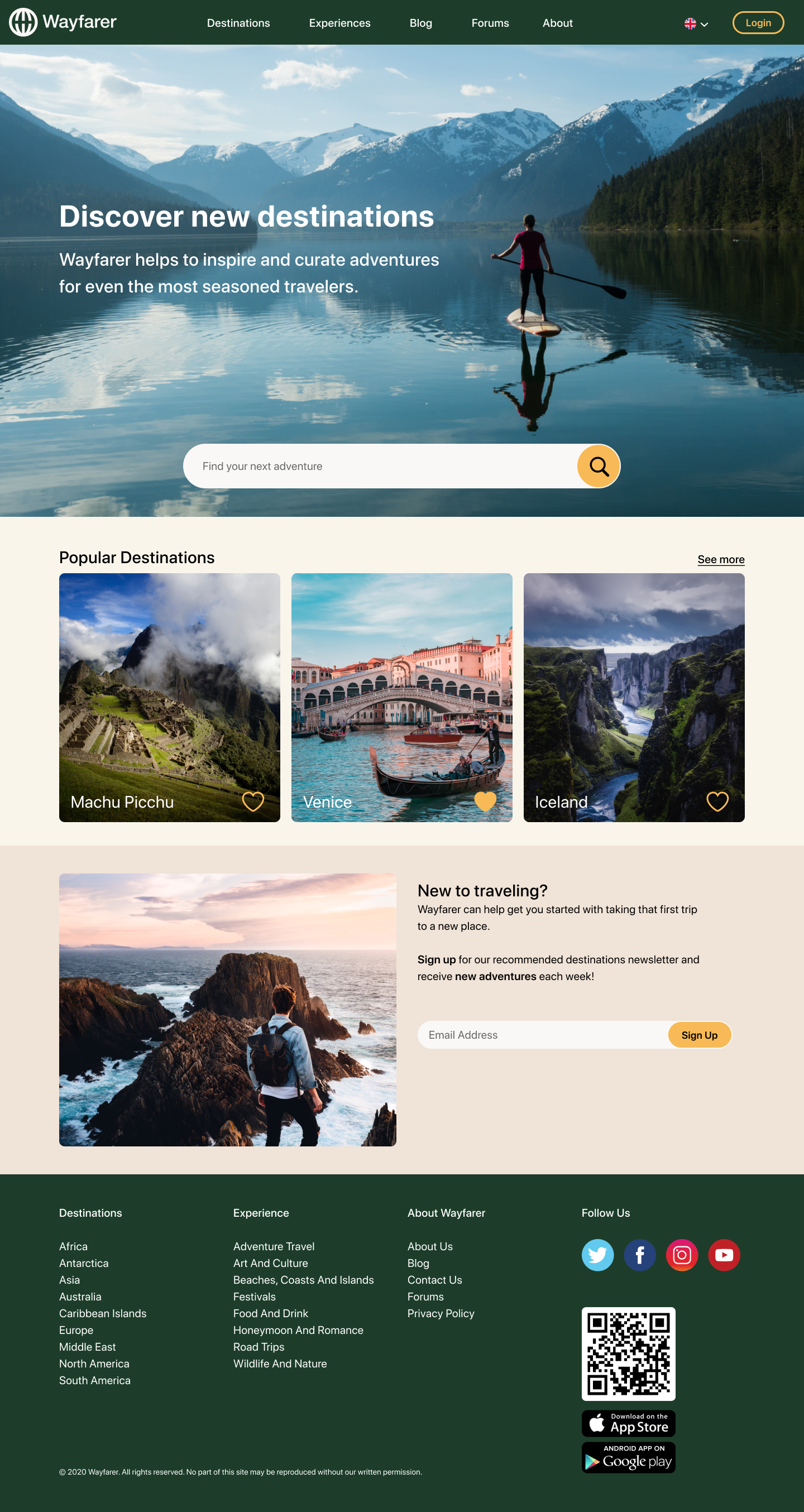
Landing page final design.


App destination details page.
App landing page.