A speculative UX design project: designing a new personal budgeting and spending insights feature for the HSBC mobile banking app, using the full design thinking methodology.
This was a speculative design project completed as part of a product design programme. The brief: design a new feature for an existing major banking app that addresses a real user need — using the full double diamond design thinking process.
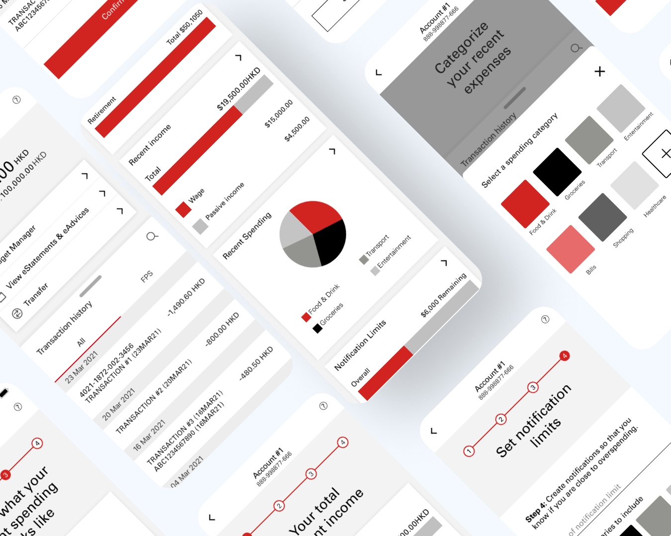
I chose HSBC because of its large existing user base in Hong Kong and the observed gap in personal finance management tools within its mobile app at the time. The goal was to design a budgeting and spending insights feature that felt native to HSBC's existing design language.
I conducted 8 user interviews with HSBC customers aged 25–40 in Hong Kong, focusing on their current money management behaviours and pain points with existing banking apps.
Most users tracked spending via a separate app (or not at all). They wanted to see insights within their banking app — not have to export data. End-of-month surprises were a common frustration.
29-year-old mid-level professional. Earns a consistent salary, has clear savings goals, but lacks visibility into his spending patterns. Uses HSBC for salary account. Doesn't use the app beyond transfers.
From the interviews, I synthesised findings using affinity mapping, then defined the core problem statement using HMW (How Might We) questions:
Working within an existing design system — rather than building from scratch — taught me to balance creative problem-solving with constraint. HSBC's brand language is conservative for good reason: it builds trust. The challenge was making the new feature feel innovative without feeling foreign.
The biggest design lesson was around information hierarchy in financial data. Users are anxiety-prone when it comes to money. The most effective designs reduced visual noise aggressively and used progressive disclosure — show the summary first, depth on demand.
The usability testing cycle was the most valuable part of this project. The jump from 60% to 95% task completion from a single layout change was a clear reminder that real users will always surprise you.