


Project Yu
Responsive Web Design
Role:
UX Design &
Partial UI Design
Team:
Business Founder
2 Business Partners
Duration:
3 Weeks

Project Background
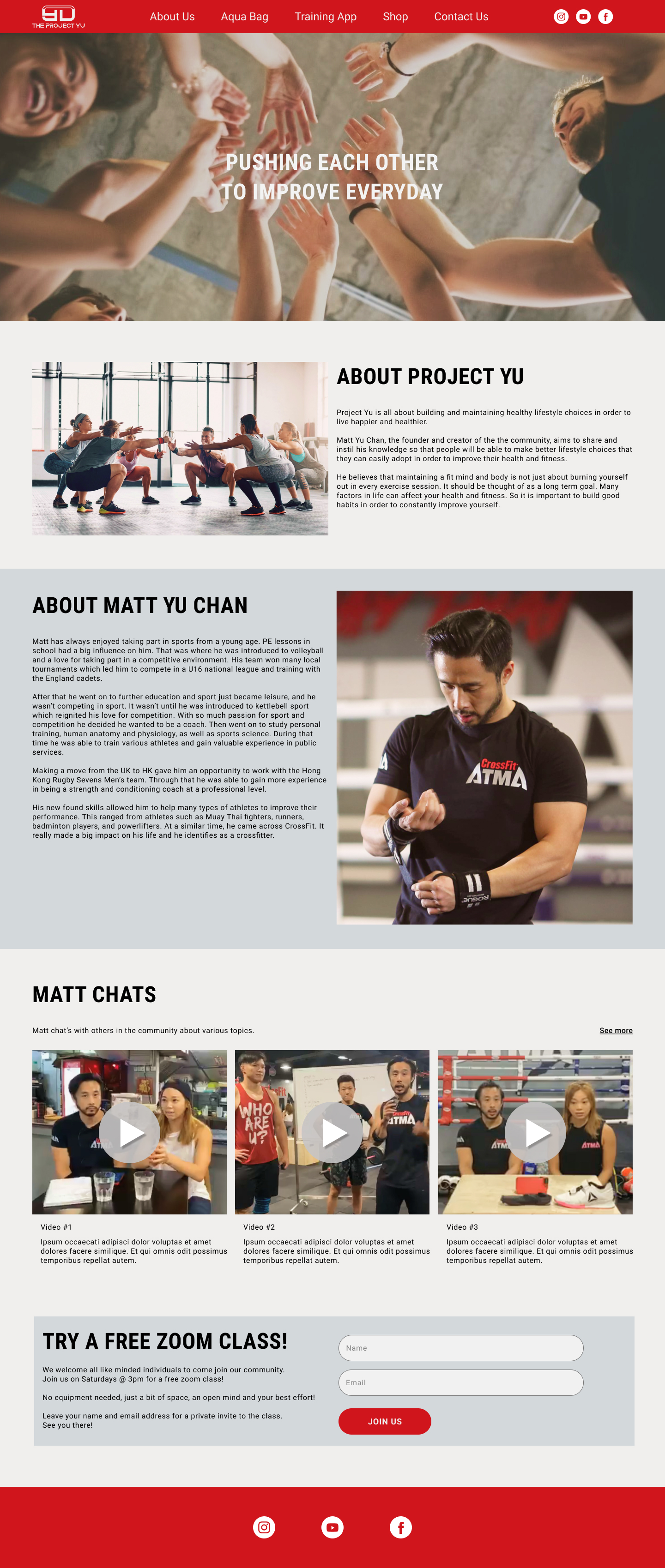
Matthew Chan is a local personal trainer who is in the process of creating his own business with the help of 2 partners. The purpose of his business is to help people build better, sustainable habits in order to lead healthier and happier lives. He aims to achieve this through exercise programs and sharing his knowledge with the community he's building around his business.
Problem
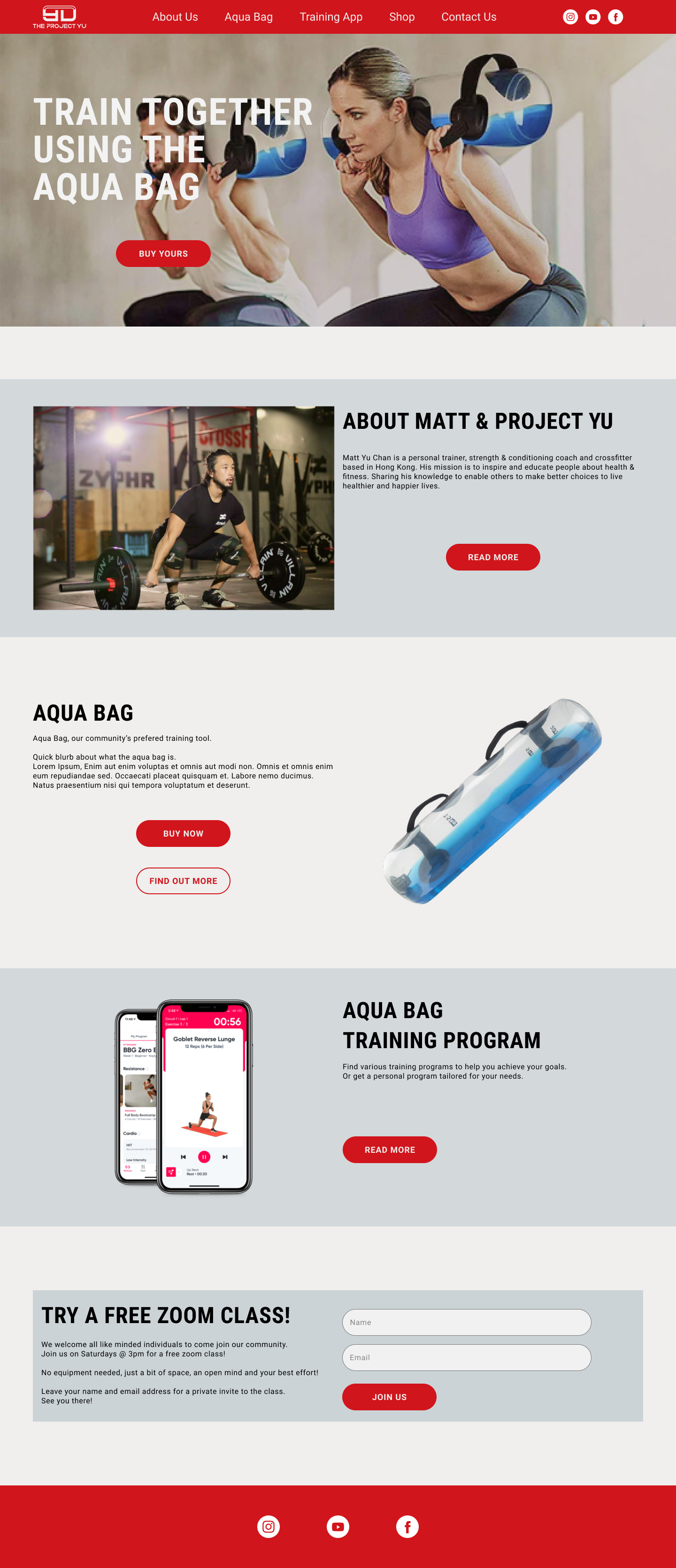
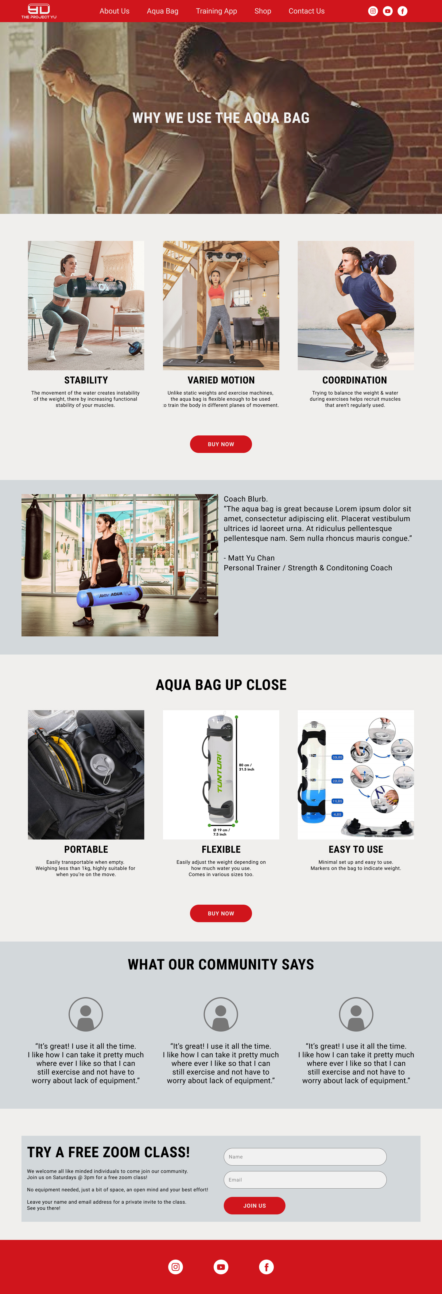
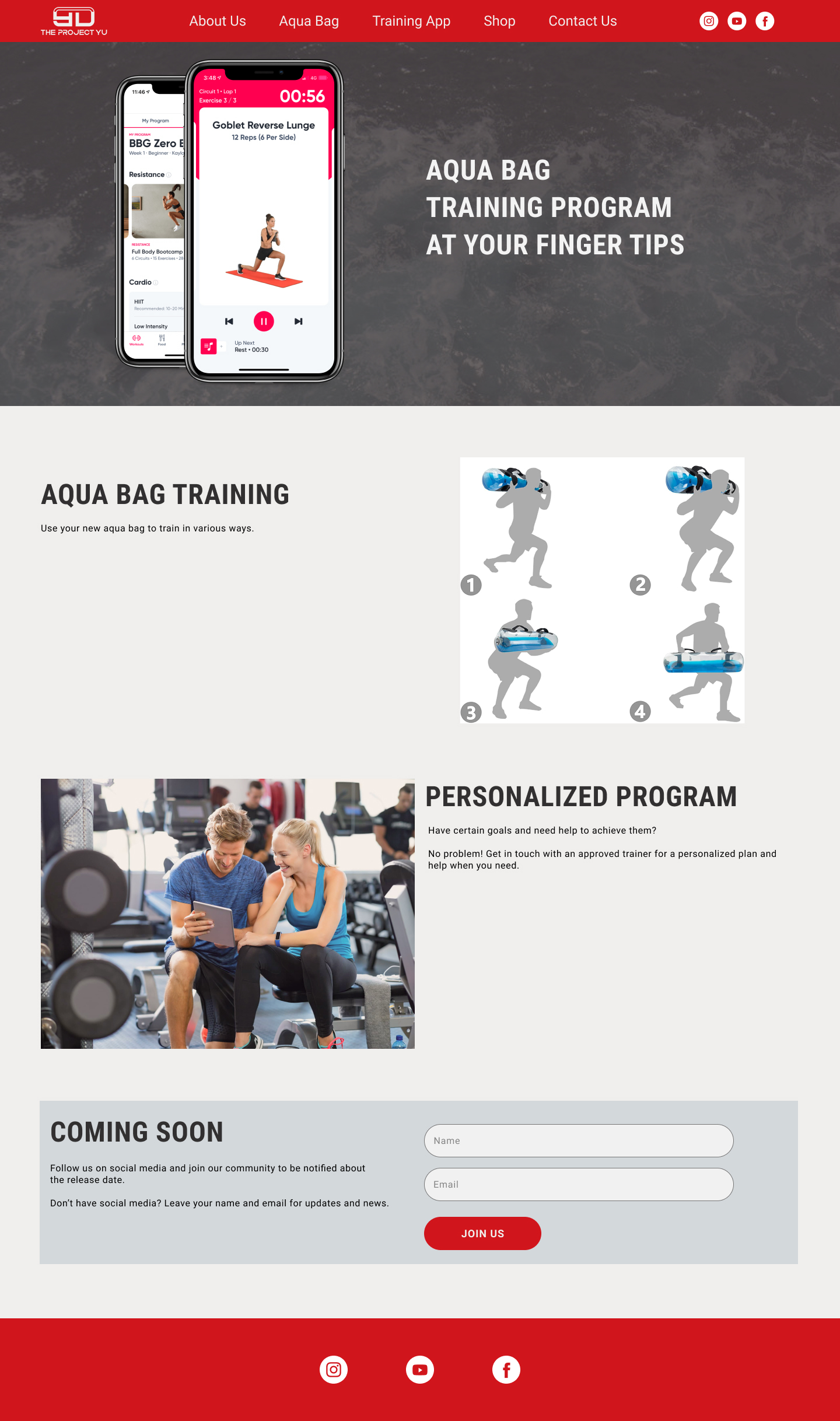
The initial goal of the business was to sell a preferred piece of exercise equipment and complement it with training programs.
They also wanted a platform where they could interact with users and share knowledge in other areas of health & fitness.
Objectives
Design a responsive website where they could promote their brand and sell products.
Help further develop their branding beyond just a logo.
Research
The goal of user research would be to:
-
Understand people’s views toward health & fitness and whether it’s important to them?
-
What helps them make better health & fitness choices?
Matthew had mentioned that he already had a target audience in mind. They would have the following attributes.
-
30 years old and over.
-
Had enough disposable income to spend on health & fitness or at least had strong enough motivations that cost wouldn't be the primary blocking factor.
-
Was conscious about making healthier choices in life but didn't necessarily know how to differentiate or chose the best ones.
-
Had a long-term health & fitness goal to achieve.
-
Needed flexibility with how & when they exercised.
-
Needed convenient and easy to use or minimal equipment that they could take with them.
We needed to verify that this ideal persona exists or at least there was a close match and make them the primary focus for research. Participants were recruited with the help of stakeholders and through my own social network.
Market Research & Competitive Analysis
Competitive research and Market analysis would also be good to help inform and verify what others in the industry were doing and if there were any upcoming trends that we might capitalize on. This was done first due to the need to schedule participants for interviews and so that I could facilitate meaningful conversations with the stakeholders.
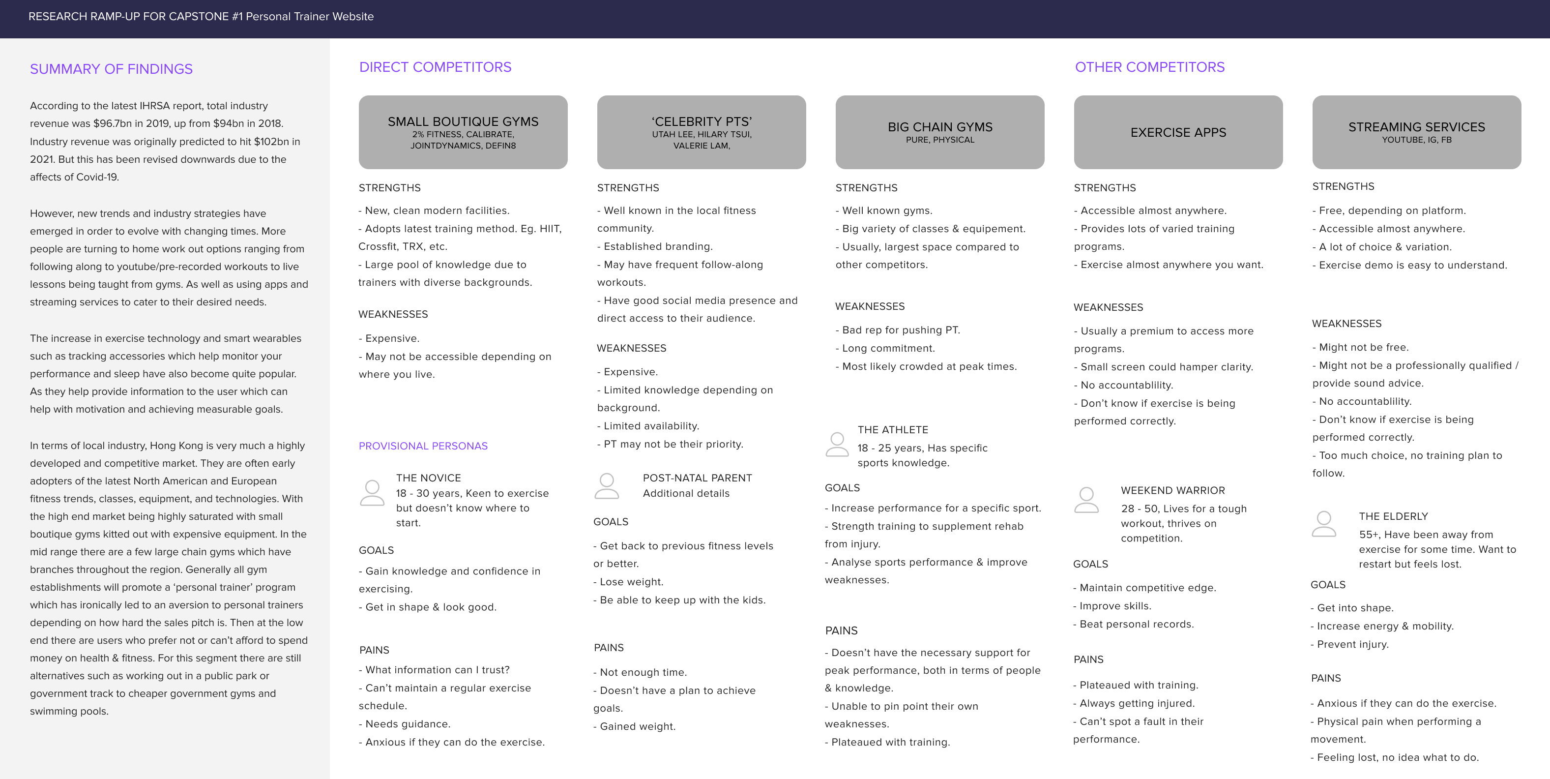
Some key takeaways from market analysis and competitive research:
-
Global pandemic slowed revenue growth of the industry.
-
The industry was quick to adapt to the global pandemic and developed strategies to deal with temporary closures.
-
Technology, particularly wearables and apps are becoming more prevalent.
-
People have a preference toward smaller boutique gyms that can offer a personalized service rather than large commercial chain gyms.
User Survey
A survey was also sent out to a wider audience to see if there were any other potential user segments that we might tap into as new customers. As well as to see what general preferences and attitudes people had toward exercising.


Some interesting results were:
-
The majority of users were female.
-
Almost 30% of participants exercised more than 4 times a week.
-
There was an overwhelming preference to exercising alone or with friends.
-
Over half of participants prefer exercising in a gym followed by at home.
-
People who had experience with a personal trainer cited some reasons being better motivation, achieve personal goals, improve technique or skills, prevent injury, and flexibility with time schedules.
User Interviews
Total of 12 participants
6 Female 30-45
6 Male 34-49
Qualitative data from my interviews were plotted onto an affinity map in an attempt to find insights. My initial thought was to group participants by how active they were and whether they were gym members. The reason being that they would align more toward Matthew's ideal target audience.


Some insights which I found were:
-
People still struggle with motivation despite being regularly active.
-
Social or personal / family activities can throw people off their routine.
-
The recent global pandemic has changed or made people seek out alternatives to exercise.
-
People need more awareness that rest also plays a big role in health & fitness.
-
Friends and family have a big impact on your choices toward health & fitness.
Define
Target Persona
By gathering all the results and research data together. We managed to verify that Matthew's target audience did indeed exist. An empathy map was created to form a basis for the target persona and was further fleshed out with extra details inspired from our research.

With all the research synthesized and a persona defined it was time to determine the main problems our persona would face and how we could potentially solve them.
POV Statements
Some problem statements which I came up with were:
-
Bella needs a flexible way to exercise in order to maintain her fitness.
-
Bella needs a way to exercise in order to stay active during self-isolation.
-
Bella needs motivation to be consistent with making healthier lifestyle choices.
-
Bella needs an interesting way to exercise in order to keep her engaged/entertained.
-
Bella needs accurate & trustworthy advice in order to make healthier lifestyle choices.
How might we's...
Reframing the problem statements above into How might we questions would help broaden ideation. However, due to time constraints, we would only be able to tackle one problem.
As a team, we decided to tackle:
POV - Bella needs a flexible way to exercise in order to maintain her fitness.
The reasoning was that if we made exercising easily accessible for our persona it would enable them to take charge of their exercise habits and adapt it to best suit their needs.
What we came up with was:
-
How might we make exercising available any time, anywhere?
-
How might we encourage people to exercise for shorter periods of time but more frequently?
-
How might we enable people to arrange exercise around their schedule?
-
How might we make exercising a daily/weekly habit?
-
How might we make exercise a priority?
-
How might we create more time for people to exercise?
Before jumping into sketching out ideas, I went back to my competitive analysis to identify any industry standards or expectations. A constraint also came up at this point which was that the stakeholders were adamant that the website platform needed to be Shopify. They had previous experience with this platform and were still very much fixated on selling products.
I took this opportunity to identify any business goals and user goals that may be satisfied together and prioritized those accordingly.
Business Goals
-
Sell products
-
Build community
-
Promote brand
-
Create a central access point for social media
-
Promote App
-
User Goals
-
Flexible & accessible ways to exercise
-
Community for motivation & encouragement
-
Alternatives to temporary gym closures
-
Reliable information regarding health & fitness
With the above goals in mind, I defined a sitemap by considering what information the user would need to be able to make the best decisions for themselves. Referring back to my competitive analysis and research I determined that the sitemap would be relatively flat with only a few major pages.

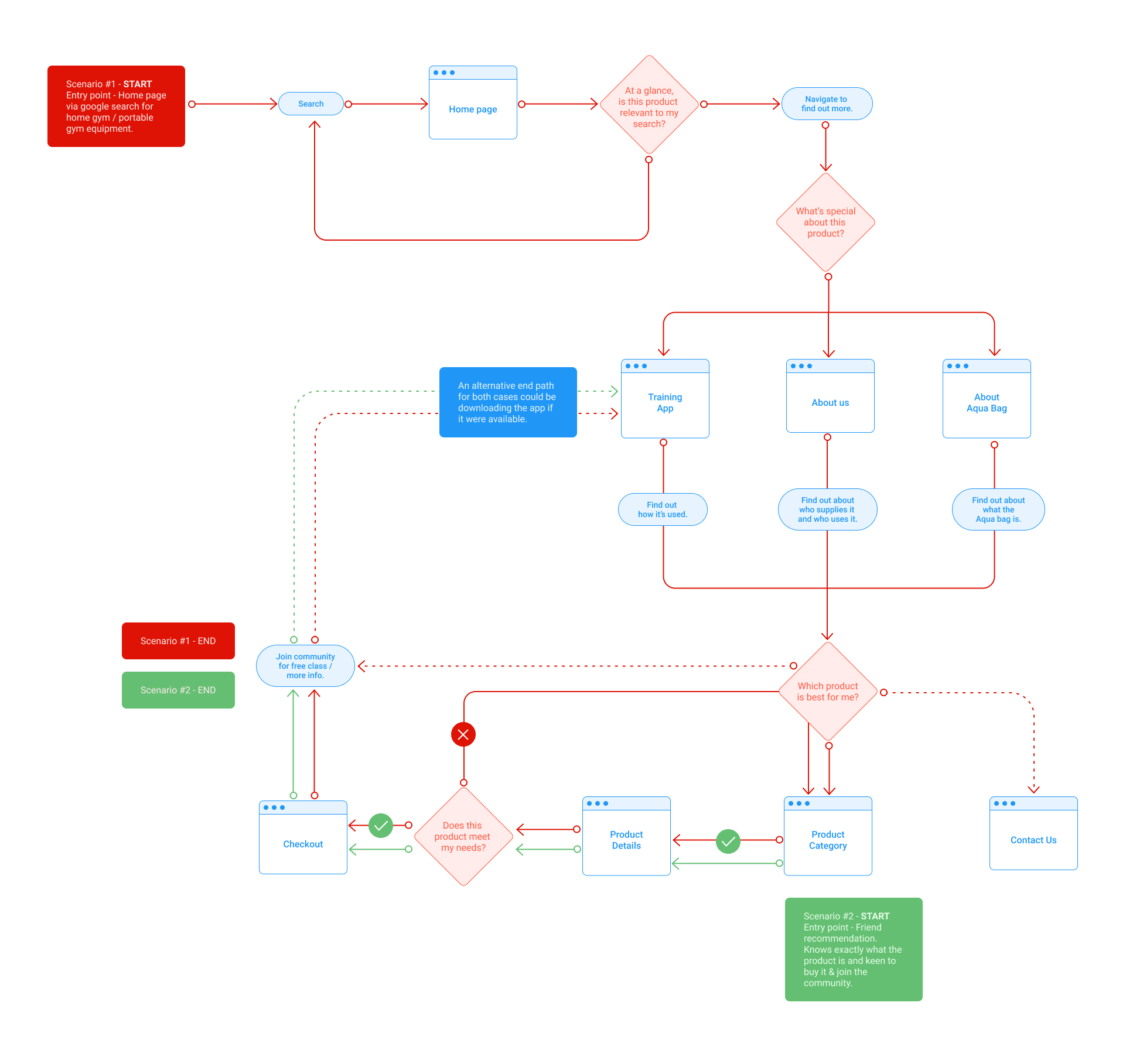
Next, a user flow was created to visualize 2 possible scenario flows through the website.
Ideate
With the layout of the website established I started on sketching out ideas for what the pages could look like. Consideration had to be given to the fact that I was constrained by the Shopify platform. Although the stakeholders had experience with the platform they didn't have the knowledge to fully customize the site with the use of HTML and javascript. So my intention was to design something which was basic and simple but still adaptable to a Shopify template.


Low fidelity wireframes for the primary pages were created for both desktop and mobile platforms.


Branding & Visual Design
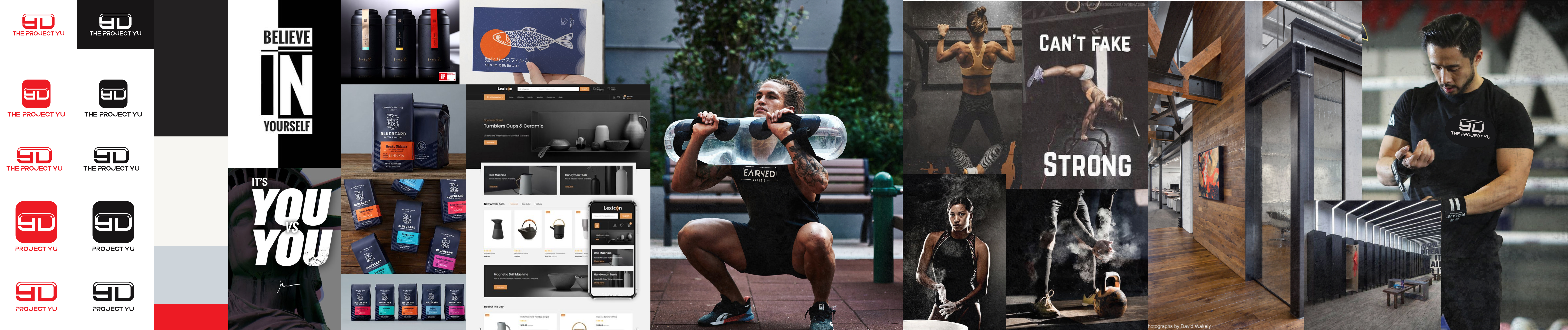
We ran through a workshop to define their brand vision however, I only had time to develop 2 mood boards to help steer the direction of their branding.
One of the stakeholders was also responsible for the design of the logo and had a graphic design background so I left the rest of the branding in her hands with agreement on the direction and feel that we had chosen.
Mood board #1
Keywords that defined this mood board were inspiring, passion & strength. However, after some consideration and review, we decided that the keywords did not match their brand vision.
Mood board #2
So instead we agreed upon inspiring, happy, and community. This was more in line with their brand purpose and we determined that visual content would play a large part in developing their brand.
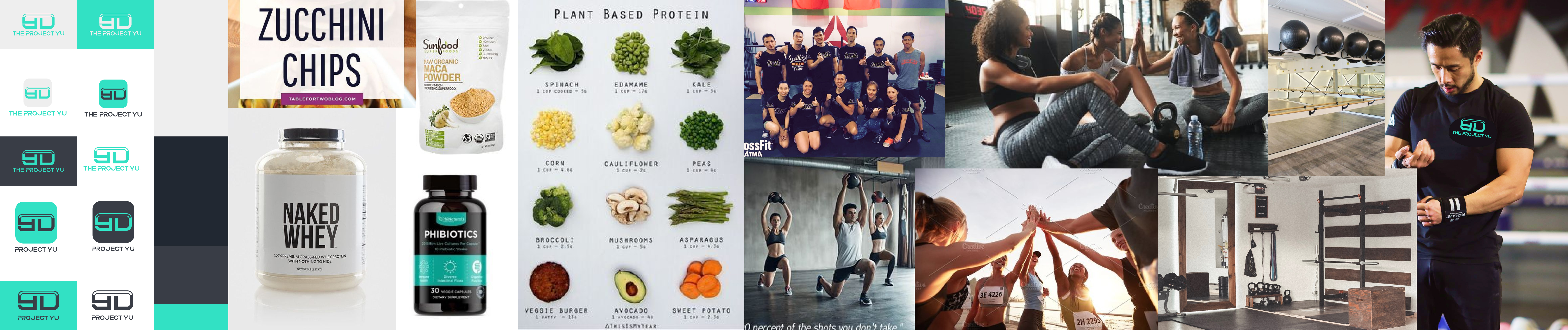
Although we had agreed that mood board 2 was more aligned with the business values and what the brand should represent the final choice to use red as the brand colour was taken out of my hands.
Prototype
Although branding was still a work in progress time was of the essence and I had to move forward with what we had. I took the visual elements we had and applied them to the wireframes to create a prototype. Extra pages would also need to be created to test out the ideal user flow.

Test & Iterate
With the prototype complete I had to set out a plan to test the design. The goals of the test were as follows:
-
Find out if users are able to purchase an aqua bag.
-
Find out user’s initial impressions of the website to determine the appropriateness of the brand.
-
Attempt to gauge whether users would purchase the product.
In order to achieve this, I would conduct moderated user testing with 3 - 5 target users. They were asked to
perform tasks related to the objectives and asked to narrate their thought process. Then questions were asked depending on how they reacted during task completion.
Results
I was able to recruit 3 participants for my test. Once I had completed the testing I collected the data and created an affinity map to help me organize and define areas of the website that needed improvement. The general consensus was that it was simple and easy to use and navigate. But there was most confusion when it came to the overall purpose of the website. For example, participants thought the site was purely for selling the aqua bag.
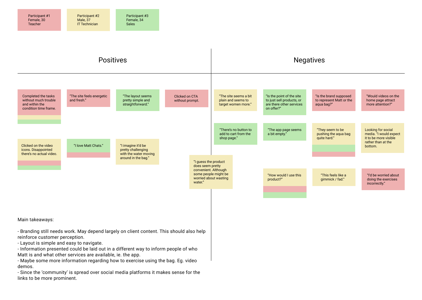
From the results of the test, it seemed that the confusion mostly stemmed from the fact that the home page was so focused on selling the aqua bag and there was not enough information to convey that there was another product (app) that was supposed to complement the aqua bag. Also because there was no information to draw the attention to Matthew, users thought the site was purely for selling a product and felt like a gimmick.
With this information and the remaining time, I had for this round of the project I only made an iteration to the home page in order to make everything feel more cohesive and less focused on the business goal.
Outcomes & Lessons
I feel like the outcome of this project was heavily skewed toward satisfying business goals rather than user needs. This may have primarily been due to the fact that there were already limitations in place and stakeholders had ideas or features that they wanted to implement in very specific ways but without sufficient research to back them up. This also leads back to the need of defining and setting a goal as a team and sticking to it as research impacts your work so much.
Given enough time I would return to the research phase in order to ask more focused questions in order to gain better insights. More time would be spent synthesizing research and stakeholders would be more heavily involved in the process.